As a part of my preparations I tried to get a grip on how the Rembrandtsplein developed over the years and how the Amsterdamsche Bank evolved over time. I discovered that the area of the Rembrandstplein where they built the Amsterdamsche Bank was previously called the Kippenhoek ('chickens corner') due to the presence of the chicken-market there. And I picked up some older photo's from that area.
Here is the Kippenhoek in 1880:
And here is the same location some 44 years later, in 1924:
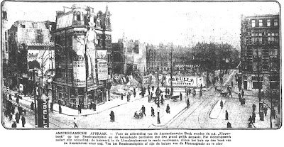
In that time, discussions occurred that lead to the design of the new head office of the Amsterdamsche Bank. This coincided with a change in the traffic routing on the Rembrandtsplein. More area was needed to allow cars and trams to pass by. So this paved the way for some changes. Father and Son Ouëndag worked together with Berlage to design the new head office for the Amsterdamsche Bank. They got all their sorts of permissions, so in december 1926 only a small part of the former buildings in the Kippenhoek remained:
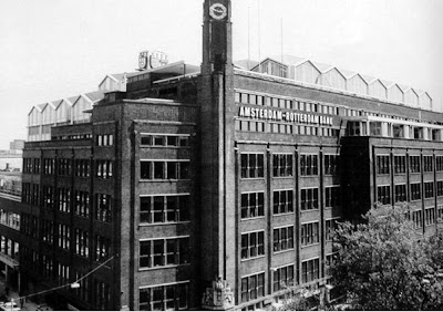
Then, the Amsterdamsche Bank was built. On the ground floor area, there were no shops, but very small windows. And even before its realization there was some discussion about it. One merchant had argued and written to the city council that, since the Amsterdam city also had to sell some pavement to the Amsterdamsche Bank, this should be sold for a price of 250 guilders per m2 with the condition that shops or window displays should be added to the design, in order to make that side of the Rembrandtplein a bit more open. The votes on this issue were insufficient however. So here we see the finished building in approximately the same direction:
Over the years, the Amsterdamsche Bank merged with Incasso Bank (a takeover) and a merger with Rotterdamse bank lead to the AMRO-Bank (AMRO for Amsterdam-Rotterdam). And the head office of the AMRO-bank had to keep up with the growth. So in the 1970s the architects Zwiers and Fontein doubled the volume of the building by adding a roof ('the tent camp' in ugly white duplex), closing the atrium inside and replacing it with regular floors and by adding the neigbouring buildings. In particular the addition of the extra roof on top of the old building led to quite some protests in the city.
In 1987 the AMRO moved its headquarters to the South-East side of Amsterdam and thus became one of the first banks to initiate a move away from the prestigious city centre. As the bank merged with ABN, it became ABN-AMRO. And around 2001, ABN-AMRO decided to sell off its buildings in the city centre. Which lead to the question, what to do with the building.
A number of plans passed around the table (among which the idea to make a huge hotel) until the Kroonenberg Groep decided to invest heavily in making it an up-to-date building. Aided by architects Kees Rijnboutt en Frederik Vermeesch they have done a great job in restyling the building. This wasn't easy. At first they wanted to kick-off the ugly tent-camp in top, but as it was part of the historical elements of the building, it had to remain. So they decided to change the material and throw in quite some changes to make the building fit in the surroundings better (see their website for a number of articles about that- in Dutch).
One very clever thing they did, was open up the former Atrium inside, letting the light back in. This immediately gives the building much of its grandeur and openness.
And some 90 years later, the Amsterdam merchant has his way. The area at street level on the Rembrandtsplein is now more open, with shops for the public (Marqt, George, Amsterdam Experience). And in number of technical details, the architects have really done justice to the soul of the building. So, although the statue of Rembrandt still has his back turned to the building, I think it is fair to say that this is a very nice restauration:
But it wouldn't be fun if there was no mystery left. And the remaining mystery of the building is the Mosaic below. The architects have been unable to determine who made it or gave it or added it to the building. And I myself am also quite curious. So anyone who knows... please let me know.


